Scott Kim, Puzzlemaster
Search Results
48 items found for ""
- Katrina / Ori Heffetz (English/Hebrew + lake reflection 2010)
Commissioned for the wedding of Katrina (at top) and Ori Heffetz (at the bottom, in Hebrew, reading right to left). I based the lettering style on a style of Hebrew I see in modern temples. Here is the lovely way they sandblasted the design into a glass block, to make the symmetry apparent. Notice that the two names are etched on opposite faces of the block, adding depth to the design. The block can be removed from the base and flipped over.
- Invisible Site (theatrical title 1992)
In the early 1990s I worked for a while with George Coates, creator extraordinary theatrical presentations which combined live performers, unusual moving sets, mesmerizing music, and overlaid projections that confused what was real and what was virtual. I told computer graphics producer Sally Rosenthal, who ran the momentous evening theater at the annual Siggraph conference, about George Coates. She immediately hatched a plan to hook George up with the graphics workstation company SGI (Silicon Graphics), and have him stage a show for one of their events. Here's a contemporary review of the show, and a technical rundown with images from the SIggraph archive. This is the logo I designed for that show. The title alludes to the space the show was staged in — a venue that George rented that was a uniquely tall church turned theatrical space in San Francisco. The logo is meant to capture the hair-raising effect of layered projections on live sets. I also designed graphics that was projected during the show...diagrams of the VALS (values and lifestyles) typology of consumer behaviors. Here's a video I made recently about VALS. I made the graphics on an SGI workstation using the 3d animation software SoftImage, which I had learned a year earlier while making the opening titles for the mathematical film Not Knot. The show was insanely ambitious, with live stereoscopic computer graphics) projected on a scrim in front of the stage. George's style of work was to start full rehearsals every night, and revise the entire production every night. It was an exhausting schedule that both pushed the crew and cast to new heights, and tended to burn people out. In one month, a first draft of the show was finished and staged for SGI, then for Siggraph, then as a theatrical show that ran for months. True to George's nature, the show continued to mutate during its run. All in all, George's productions epitomize the heady blend of creativity and technology that is so common in San Francisco, most famously embodied by Burning Man and the Maker Faire.
- Tomoko Fuse (Geometric construction, 1996)
Created for Key Curriculum Press as a gift to Tomoko Fuse, 1996. Tomoko Fuse (the last name is Japanese, pronounced with two syllables) is a master of unit origami, in which many squares of paper folded into simple identical units interlock to form intricate polyhedral forms. Her book Unit Origami is published in the United States by Key Curriculum Press, a leading publisher of books and software for mathematics education. For this design I made letters out of the most common unit origami unit: isosceles right triangles in alternating colors.
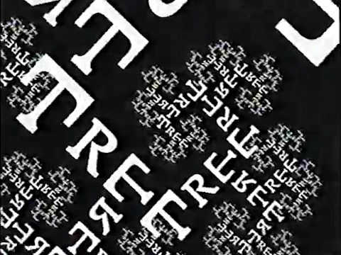
- Tree (Animation, 1981)
From the book Inversions, animated for video Watch Your Language, shown at Siggraph '96. This animation was inspired by the film Space-filling Curves by Nelson Max, which features infinite zooms on self-similar recursive figures. Each E in the word TREE gives birth to two more smaller trees. A wall-sized version of this design can be seen at the Boston Museum of Science.
- Tron
SYMMETRY. 180° rotation. INSPIRATION. In the 1970s I was a big fan of the emerging field of computer graphics, and spent many memorable evenings watching demo reels at Information International courtesy Richard Taylor, who has gone on to a spectacular career in special effects. This was the early days, when computer graphics was just starting to appear in TV commercials. When TRON was in the works — the first feature film to include extensive computer animation — I drew this ambigram and sent it to Richard. (The original was monochorme; this version has been enhanced with the metallic effect of the film's logo.) My ambigram didn't make it into the movie, but it did appear on the special effects crew jackets and hats.
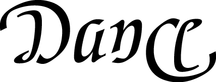
- Dance (180 degree rotation, 1990)
Designed during a residency at Princeton University, February 1990. In 1990 cybernetic sculptor James Seawright invited me to Princeton University for a 2-week residency. During that delightful time I worked with students on creating inversions and exploring letterforms. My temporary office was in the art department, which housed both fine arts and performing arts. I was fascinated by the way each artform had a different characteristic body position: painters straddling wooden benches, ceramicists on high stools hunched over their work, dancers with bodies extended. I sketched a series of inversions on the names of all the different arts, a series I hope to realize as physical objects in the corresponding media. I made several versions of the word "Dance", including versions for jazz, modern, square and folk dance. This version was inspired by ballet.
- ELISE ESTHER DIAMOND (1997)
SYMMETRY. Bilingual containment. "Esther" in Hebrew is hidden inside "Diamond" in English. INSPIRATION. Commissioned by my mother, Pearl Kim, in honor of Elise's Bat Mitzvah. STORY. Elise Diamond studies piano with my mother, Pearl Kim. She enters high school this fall and is also studying percussion. Esther is one of her several middle names. My mother is one of my most demanding patrons. She especially likes commissioning designs for her piano students. She sent this one back to the drawing board when the first version turned out to be too square and not feminine enough. "You can do better," she urged me, "and it's good for you stretch." This is the third bilingual English-Hebrew inversion I've done. I'm told that there are similar bilingual signs in Israel. Hebrew reads right to left, so it is especially interesting to combine it with a language that reads left to right. From right to left, the four Hebrew letters are Aleph (E), Samekh (S), Taw (T) and Resh (R). As is usually the case with inversions that involve a language in which I am not fluent, I'm never quite sure if the liberties I have taken are permissible. In this case the biggest liberty is introducing an extra stroke in the middle M/Taw; the rest of the Hebrew letters are rather ordinary.
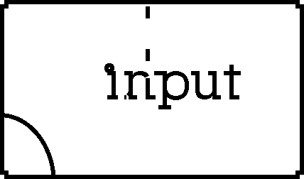
- Input/Output (Animation, 1985)
For Input/Output, an exhibition of computer art curated by Lucia Grossberger Morales for the Siggraph '85 computer graphics conference. What goes in, must go out! In 1985 the Macintosh computer was new and I was just starting to explore what you could do with short animation loops on the computer screen. The images were drawn in MacPaint and animated in a prototype animation program called Fellini.
- NUEVA (1984)
SYMMETRY. Reflection about a vertical axis. This image looks the same when seen in a mirror. INSPIRATION. Created for the Nueva School, a private prekindergarten through eighth grade school, founded in 1967 in Hillsborough, California. STORY. I have long been a fan of this outstanding school. Having been appalled by my own grade school education -- although excellent by conventional standards -- I like being around a school that shows me a better model. The various parts of the school feel more like university departments, with devoted teachers, remarkable curriculum, and a strong sense of making every aspect of the school better every year. Very high parent involvement is certainly a big part of the school's success, as it is with most outstanding schools. A high school teacher of mine who received students from many different intermediate schools including Nueva reported that students from Nueva were more self-confident and much less likely to take a statement as true just because an adult said it. Reports from friends who went to Nueva are that it can be hard to enter conventional high schools after attending Nueva. I am especially interested in the math teachers at Nueva, who include Mary Laycock and Peggy MacLean. Their well-developed methods around using physical manipulatives in the classroom result in an entire school population that takes math confidence for granted. I hope to bring some of their thinking to software one day. This mirror image design, inspired by one of my first visits to Nueva, has been popular on t-shirts, tote bags and other items sold by the school.
- Golomb (Dissection, 1996)
For Solomon Golomb, mathematician and inventor of pentaminoes. Created for a presentation to MathCounts, a national junior high school mathematics competition, May 10, 1996. If two squares side by side is a "domino", then n squares joined side by side to make a shape is a "polyomino", an idea invented by mathematician Solomon Golomb of USC. There are two distinct "trominoes" (three squares): a straight line and an L. There are five distinct "tetraminoes" (four squares), popularized in the computer game Tetris, which was inspired by Golomb's polyominoes. Shown above are the twelve distinct pentaminoes -- shapes made of five squares. There are dozens of games you can play with pentaminoes, like trying to arrange them into a 5 by 12 rectangle, 6 by 10 rectangle, or 3 by 4 by 5 solid. A two-person pentamino game was filmed for the movie 2001, but was cut in favor of chess. 2001 author Arthur C. Clarke later incorporated pentaminoes in his novel The Fountains of Paradise. If you are interested in purchasing a set of pentaminoes to play with, check out the online puzzle store Puzzletts. My favorite pentamino sets are ones made of 3-d cubes, not just flat squares, since they can be stacked into three-dimensional shapes as well as flat shapes. There are twelve pentaminoes and six letters in "Golomb", which leads to the nice challenge of spelling "Golomb" using just two letters to make each letter shape. First I worked on the "O"s. I wanted both shapes to be the same, and to have at least mirror symmetry since they couldn't both have rectangular or square symmetry. The long piece obviously belonged with the "L", and the zig-zag piece with the "B". Making a convincing "M" was rather difficult. Finally I used the remaining pieces to make a "G", probably the weakest letter. Solomon Golomb is a prolific inventor of interesting bits of recreational mathematics, including Rep-tiles (shapes that can be dissected into several smaller copies of the original shape) and Golomb's Ruler (if a ruler has markings only at 1, 3, 6 and 7 inches, it can still measure every integer distance from 1 to 6 inches in length). You can read more about polyominoes in Golomb's book Polyominoes, published by Princeton University Press.
- J. S. Bach (1981)
SYMMETRY. Reflection about a vertical axis. Looks the same in a mirror. INSPIRATION. Appears in my book Inversions as part of a trio of inversions in tribute to the book Gödel Escher Bach. STORY. As a pianist, I've always been drawn to Bach's music. I am particularly fond of the canons and fugues in the Well-Tempered Clavier, Musical Offering and Art of Fugue. Canons are similar to inversions — the goal in both cases is to compose an aesthetically pleasing result by following a mathematically precise rule. I have composed a number of canons over the years. Here is a Canon by Augmentation I composed on the theme of the Musical Offering. There are two voices, which start an octave apart. Both voices play the same notes, but the higher voice plays twice as fast as the lower voice. Notice that the higher voice completes two repetitions in the time it takes the lower voice to complete one. The exact symmetry is broken only on the last note. I wrote this canon as a gift to Douglas Hofstadter when I was helping him teach a course based on the then forthcoming book Gödel Escher Bach.
- Mirror (1981)
SYMMETRY. Reflection about a vertical axis. INSPIRATION. Created for my book Inversions. STORY. When I wrote Inversions, I needed to fill out my quota of sixty words. One of the subjects I chose was symmetry. Besides MIRROR, I also did inversions on UPSIDE DOWN and SYMMETRY. Naturally I wanted to write MIRROR in mirror symmetry. Note that the M reflects into the three letters ROR, and that the centrally placed dot bonds with either of the two I's. Also notice that the place where one stroke passes under another at the top of the O separates the second R from the O. The lettering, influenced by the calligraphic style called Fraktur, helps rationalize the odd shapes.